At WiseGEEK, we're committed to delivering accurate, trustworthy information. Our expert-authored content is rigorously fact-checked and sourced from credible authorities. Discover how we uphold the highest standards in providing you with reliable knowledge.
What is a Renko Chart?
A renko chart shows only the price movements of an asset, unlike other charts that usually also show timing and volume. Developed by the Japanese, the name of the chart comes from the Japanese word renga, which means "brick." The chart consists of bricks, each of which represents a range of prices. Every time the closing price surpasses the range of the previous brick, another brick is added to the renko chart, which can display price movements of currency rates or stock prices. Usually, one color represents a downward movement and another color represents an upward movement.
A renko chart has the benefit of more clearly showing support and resistance levels and price movement patterns. A regular chart based on the timing of price movements could show drastic drops or rises using long rectangles, making price movements relatively less prominent. Renko bricks also screen out small price movements less than the brick size, making trends easier to spot. If a downward brick follows a series of climbing bricks, a trader could quickly make a decision to sell his or her assets.

The renko chart sometimes displays false signals, such as when the price movement suddenly reverts back to its previous direction, an event also known as the whipsaw effect. This is seen, for example, when a chart trending upward has a few bricks that show a downward movement, and then moves upward again. To minimize the risk of losses from the whipsaw effect, investors using the renko chart often wait until at least two or three bricks appear to indicate a new direction before buying or selling the asset.
An investor can adjust the size and color of a renko chart brick according to his preferences. A chart with smaller bricks has a greater number of bricks and shows price changes in more detail. A new brick is only added to the chart when the price change completely fills the brick. For example, if the brick size is $5 US Dollars (USD) and the price only moves by $4 USD, then no new brick is added. Traditionally, the bricks are black when the price movement trends downward and they are white when it trends upward, but the investor can customize the color and other details of his renko chart to suit his needs.
A renko chart usually uses closing prices at the end of the day. It can also use high/low prices, which favor white or upward-trending bricks. Regardless of the current direction of the bricks, the chart that uses high/low prices ignores the day's low prices if the high prices allow new white bricks to be added.
AS FEATURED ON:
AS FEATURED ON:

-
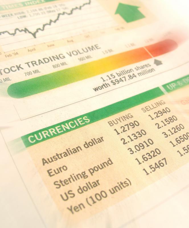
![A renko chart may be used to depict currency rates or stock prices.]() By: Johnny LyeA renko chart may be used to depict currency rates or stock prices.
By: Johnny LyeA renko chart may be used to depict currency rates or stock prices.
Discuss this Article
Post your comments